Building Brand Authenticity With Color
Dalia Martinez • Jun 18, 2021
3 minutes
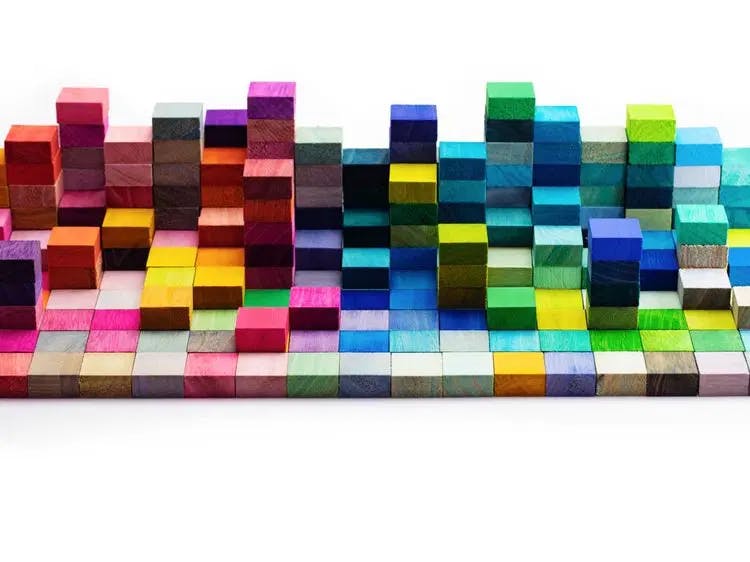
Creating brand authenticity consists of multiple factors, but choosing the right colors is at the heart of it. Studies show color is used by marketers to strategically alter brand personality, purchase intent, likability, and brand familiarity.
With so many social changes, brand authenticity has never been more important. SproutSocial, a social media management platform, reports that “younger generations say that brand authenticity is second to only discounts when determining which businesses to buy from.” How a company shapes perceptions to the public can really determine wether it sinks in these volatile markets.
That’s why the impact of color in forming brand perceptions cannot be ignored. From mom-and-pop shops to multi-national corporations, color is at the heart of brand story.
The color scheme assembled by designers plays a key role across your various marketing assets - from building a websiteand the design of a logo to a site’s colors and much more. Employing brand colors consistently and across all platforms can result in a unified look and feel to your company, making them memorable and recognizable.
Colors That Work
A study from the University of Missouri-Columbia revealed that blue logos invoked feelings of confidence, success, and reliability; green logos invoked perceptions of environmental friendliness, toughness, durability, masculinity, and sustainability; purple logos invoked femininity, glamor, and charm; pink logos gave the perception of youth, imagination, and fashion; yellow logos invoked perceptions of fun and modernity; and red logos brought feelings of expertise and self-assurance.
Colors speak to us in ways we’re not even aware of.
Picking the right colors for a site depends on how the website serves a user and how they want the user to feel during the process. If a brand wants to convey security and trust, the dominating color can be blue like AT&T, Facebook, and American Express. Target, Virgin Atlantic, and Nintendo use red to express excitement. In the digital space, color can help contribute to a brand’s personality, set up a relationship with customers, and build authenticity.
These global organizations have established brand authenticity in their digital spaces (and some of the biggest companies, like Coca Cola, had established brand authenticity long before the Digital Era). Brand authenticity is carried in culture. It comes through company values, the CEO, a company’s history, and what a company does internally and externally. But in modern times, brand authenticity is built in the digital space through a delicate dance of UI and colors.
Brand authenticity requires colors that work in the digital and non-digital spaces. The digital space is our first stop with purchases, planning vacations, and browsing all kinds of products and services. The pandemic only reinforced the need to connect customers to brands online and the way to do it is by paying strong attention to the story that colors and brand authenticity tell.
Simplicity Helps Authenticity

Source: Shutterstock.com
Companies that have managed strong brand authenticity have simple color palettes— often it’s between 2-3 colors. Think of Pepsi, Apple, or Amazon, and chances are you can name a primary color used in their logos and sites, respectively. Color simplicity is key in UX design strategy and it’s also key in creating brand authenticity.
A triad of colors for a website’s design is enough to balance the messaging around company values with emotions from the user journey. Colors must also uphold the user experience. Seems like a lot to ask of colors but the right UX designer’s eye can achieve this formula through the site’s UI elements.
Strip away unnecessary elements, add the right colors, and you can foster brand authenticity. Brand authenticity needs to be simple. Simplicity lets the users know there is nothing to hide. Users don’t need to overthink. They can trust the brand when the message is clear.
Codazen Solutions: Pretty Is as Pretty Does
When you apply colors with brand authenticity in UX design, it is very intentional. Senior UX Designer at Codazen, Josh Grieve, says, “we place chosen colors depending on the section of a page. We pay attention to what we’re trying to accomplish in each section with each UI element, for each step of the user journey.”
Gestalt Theory is the theory of visual perception and how our eyes and brains interpret what we see. The Gestalt Principles are always at play as we take into account the difference between primary and secondary colors. Each part of visual design falls into: Proximity, Similarity, Continuity, Closure, Figure/Ground, and Simplicity. Our designers use Gestalt Theory when determining what colors render the most authentic experience for customers and brands.
We consider what colors are more neutral or more vibrant. We also do visual quality assurance and testing for our colors to meet Web Content Accessibility Guide (WCAG) standards. After all, a site has to be easily accessible to help build authenticity.
It’s not just about making a website look pretty with the right colors. It’s about having the colors work well with the website’s function.
Contact us to learn more about how we can help you employ the power of color.