Hey Southwest Airlines, Show Your VIPs Some LUV!
Danny Petrovich • Sep 25, 2020
3 minutes
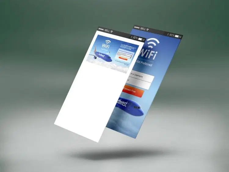
Southwest's current sign-in site vs. Codazen's reimagined concept. (Courtesy: Codazen.)
I travel pretty frequently. As Codazen’s Executive Creative Director, it comes with the territory. My CEO, Mike Merchant, travels even more and has A-List Preferred Member status on Southwest Airlines. On one of our trips to meet up with a client in Menlo Park, Mike leaned over and showed me the A-List Preferred WiFi connection site on his phone:
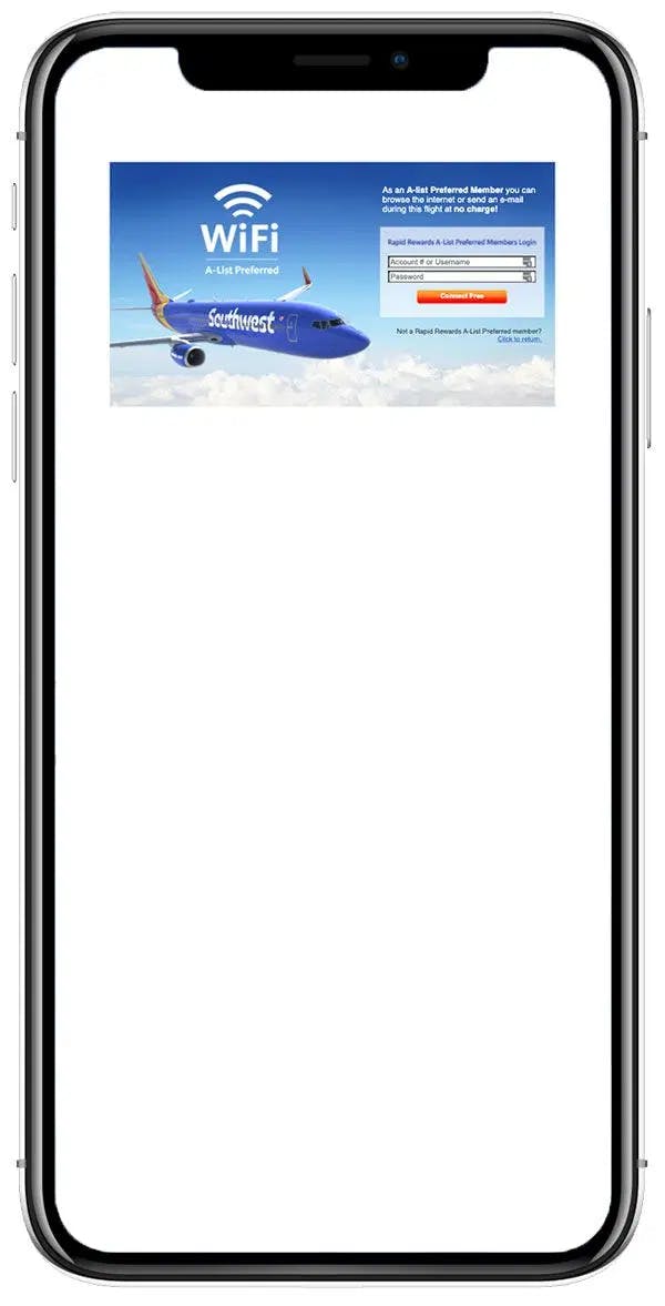
Screenshot of Southwest’s A-List Preferred WiFi sign-in site on mobile phone. (Courtesy: Codazen.)
We’re still shocked when we see companies (and even design agencies) that don’t take a “mobile-first” approach to designing their web product experiences.
Southwest is a well-known, successful brand. This website is experienced by top business clients every time they want to connect to the in-flight WiFi. These flyers are running global companies and have flown thousands upon thousands of miles to qualify for A-List Preferred status. As elite business travelers, they expect the customer experience (CX) to be easy, light and beautiful.
A website that’s difficult to use can give off an air of low tech-savviness and unprofessionalism that taints a brand’s reputation. Competition is fierce. If these travelers aren’t getting the CX they want, they could easily go to another airline that’s geared towards executives and commuters.
Over the years, we’ve seen a pattern of companies not taking mobile into consideration. This neglect can have a negative effect on the end user, especially with so many people relying on their phones to access services. When you design an experience with a “mobile-first” approach, the limited screen real estate forces you to think about what’s really important to include.
We took it upon ourselves to re-design the Southwest Airlines A-List Preferred WiFi sign-in site as an example of six ways to improve the CX. These solutions apply to any website.
#1: Avoid Logging in Altogether
One of the best ways to make a flyer’s life easier is to enable activating free WiFi from the Southwest App. That way, customers don't need to log in on the site at all, and most of the time, they're already logged in on the app. The app currently works while onboard the plane for certain functions, so this is a natural progression of that.
But if logging in is a must...
#2: Make It Responsive
Mike and I had trouble using the A-List Preferred WiFi site on our flight because the page wasn’t responsive. We had to pinch and zoom just to read the text and interact with the form fields. I had trouble reading the “Click to return” CTA, and wouldn’t have even noticed it if we didn’t zoom in.
Because the screen is designed for a landscape, desktop view, it doesn’t take advantage of the phone’s vertical (portrait) screen.
At Codazen, our Product, Creative and Technology teams work in unison to deliver “responsive” layouts that automatically adjust to different screen sizes to give users an optimum experience, whether they’re on a laptop or smartphone. The words and fields should be easy to access and interaction should feel fluid, with text and images adjusting depending on the screen size. Flyers are saved from the inconvenience of having to zoom in to get the content they’re after, which can be frustrating whether you’re on the ground or 36,000 feet in the air.
Consider our redesign here:

Mobile-first, responsive concept for the A-List Preferred WiFi site on mobile phone. (Courtesy: Codazen.)
#3: Take Away the Added Steps
The need to pinch and zoom just to read text and interact with form fields adds unnecessary steps. Each added action is one more opportunity to lose a user. If a website is going to ask users to give information, make it as easy as possible for them to do it. Otherwise, they’ll leave.
For mobile, increasing the form field height size to a minimum of 40px helps solve this problem. Bigger fields lets customers use their fingers to tap on the field to interact with it. The simpler the process, the better the CX and the more likely the user will complete the task. For this website, less really is more.
#4: Keep It Short and Sweet
This less-quantity, higher-quality approach is applicable to the copy as well. Reading through the site, I noticed there were a lot of words.
For example, the instructions look more like a legal disclaimer. In our redesign, we eliminated excessive copy while using the space for other necessities:
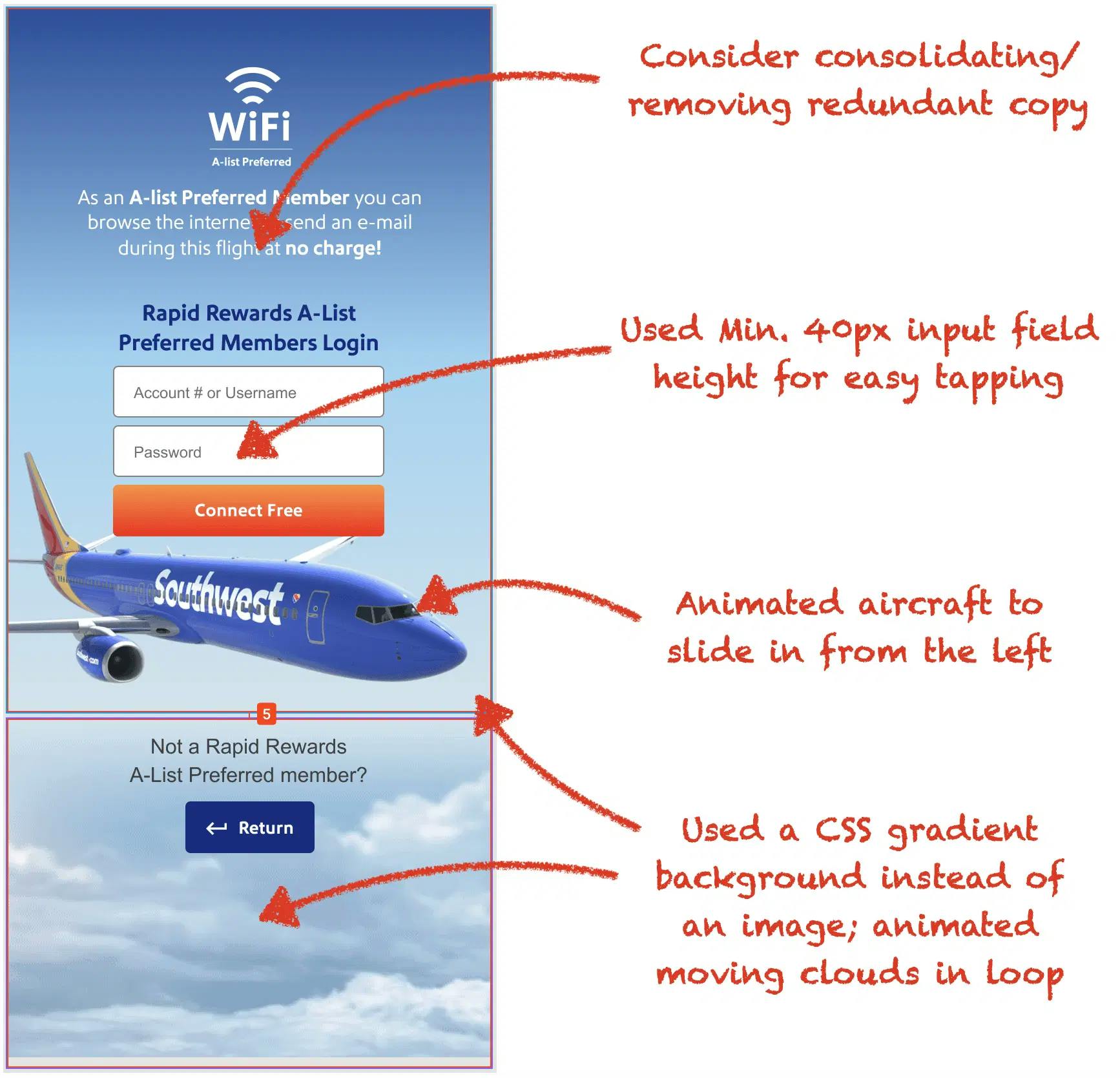
Applied improvements in concept for the A-List Preferred WiFi site on mobile phone. (Courtesy: Codazen.)
Too much text runs the risk of users just glossing over it. It’s vital to condense the copy while still getting the message across. One way to do this is to take out repetitions. For example, the text at the top of the website says that A-List Preferred Members can use the WiFi at “no charge.” The button in the middle of the site repeats this fact with the words “Connect Free.” Taking out the repetitive lead-in would create cleaner copy while still providing the needed information.
The lower the word count, the greater the importance given to the words that are there. And making it more scannable increases the probability of users actually reading the text.
#5: Create an Immersive Experience
The website design right now is static, and static can equate to boring. When I use a website, I want it to build up excitement. I want it to entice me with an immersive experience. I want to know that I’ll be getting value by entering my information.
One way to achieve this is through movement. In our mockup we replaced the motionless clouds beneath the Southwest plane with rolling clouds that gently float past the aircraft to give a subtle yet dynamic feel. The plane itself can fly into the frame to build more excitement.
All these simple touches give customers a reason to want to interact with and explore the website. And as they explore, they can learn more about the airline, fostering good feelings they’ll remember once they disembark. That’s what good CX is!
#6: Optimize, Optimize, Optimize
Load speed is one of the major factors in determining whether a customer gives up on a website or not. According to Google, 53% of mobile users will leave a site if it takes more than 3 seconds to load. Aircraft WiFi tends to be pretty slow. That means a site like Southwest Airlines A-List Preferred can take 5 to 6 seconds to load, while our optimized version would take less than 3 seconds, even with animations.
In order to bridge this gap between a customer’s expectation of fast load speed and Southwest’s mobile capabilities, it’s critical to optimize the graphics on the website. Rule of thumb is the bigger the image files, the slower the load speed. The current image being used is much larger (physically) than it needs to be because it’s made to accommodate a desktop screen.
Our version uses mobile-sized graphics at a higher “retina” resolution so the images look much sharper. And with our image compression techniques and utilization of a CSS gradient background instead of the full-screen sky image, these higher resolution assets actually result in a 52% smaller overall file size. This optimization is key to fast load speed and higher user retention.
Codazen Expertise: Customer Experience
By making the A-List Preferred WiFi website faster, easier to use, and more intuitive, Southwest can provide the professionalism and tech savviness that their top customers have come to expect. A Codazen strategic redesign is low-hanging fruit for Southwest’s signature in-flight CX that serves thousands of their customers.
Keeping the focus on the user at every step when creating a responsive design ensures that the website gives everyone the mobile experience they’re after, regardless of the device used.
At Codazen, we see companies with a lot of similar usability and design problems on a daily basis. We love embedding with clients and presenting creative solutions. Better customer experiences build customer loyalty while heavily contributing to higher ROI.
Contact us to learn more about how we can help your business.
(And if you’re a Southwest exec, be ready to see more on Codazen’s A-List Preferred website remodel.)